In my last post, I showed the buildings in Oslo inner city that have 500 metres walking distance or less to any green area, or at least the areas that are classified as 'green' in the AR50 dataset.
(Btw I, I write this in English since some international GIS students at the University of Oslo should be able to read it too)
To make that map with 'green accessibility', I ran a service area analysis.
(Btw II, the analysis in these maps is an improvement over the one in the last post. This time, green areas outside the inner city urban districts (bydeler), which may be within walking distance from inner city buildings, are now taken into account)
One of the maybe most interesting, and crucial, choices you do when you run a service area analysis, is the choices you make about Polygon Type.
You can choose whether you want to make detailed or generalised polygons. You can also choose whether you want to trim the polygons (i.e. the service areas), and in that case, how much you want to trim them.
These choices have a crucial impact on the extent of the service areas you want to estimate.
For example, in the map below, you can see the difference between service areas made with detailed (red) and generalised (purple) polygon type settings.
As you can see, the detailed polygons seem to depict more accurate service areas (no big surprise there). Generalised polygons are the quick and easy ones, although, it took no longer time to produce the detailed ones than the generalised polygons (spent approximately 30-40 seconds on both sets).
With the detailed polygons, you do get some small islands out of reach here and there (as mentioned in ESRI's documentation on service area analysis). My really big issue with the detailed option, though, and the reason I prefer the generalised option, is that it is more sensitive to errors in the underlying network dataset. And errors do exist in network datasets.
Now, what does the trim setting do? First, let see the difference between polygons with and without trimming.
Finally, the maps were made with the following (open and free) data sources:
(Btw I, I write this in English since some international GIS students at the University of Oslo should be able to read it too)
To make that map with 'green accessibility', I ran a service area analysis.
(Btw II, the analysis in these maps is an improvement over the one in the last post. This time, green areas outside the inner city urban districts (bydeler), which may be within walking distance from inner city buildings, are now taken into account)
One of the maybe most interesting, and crucial, choices you do when you run a service area analysis, is the choices you make about Polygon Type.
You can choose whether you want to make detailed or generalised polygons. You can also choose whether you want to trim the polygons (i.e. the service areas), and in that case, how much you want to trim them.
These choices have a crucial impact on the extent of the service areas you want to estimate.
For example, in the map below, you can see the difference between service areas made with detailed (red) and generalised (purple) polygon type settings.
 |
| Click on the map to see it larger. |
As you can see, the detailed polygons seem to depict more accurate service areas (no big surprise there). Generalised polygons are the quick and easy ones, although, it took no longer time to produce the detailed ones than the generalised polygons (spent approximately 30-40 seconds on both sets).
With the detailed polygons, you do get some small islands out of reach here and there (as mentioned in ESRI's documentation on service area analysis). My really big issue with the detailed option, though, and the reason I prefer the generalised option, is that it is more sensitive to errors in the underlying network dataset. And errors do exist in network datasets.
Now, what does the trim setting do? First, let see the difference between polygons with and without trimming.
 |
| Click on the map to see it larger. |
As you can see, you should have some extremely good reasons to choose polygons without trim over trimmed polygons.
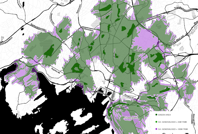
With that settled, what is the impact of the of the trim distance? To trim the 500 m service areas with 100 metres sounds too much. Let's try with a trim distance that is five percent of the service area distance.
 |
| Click on the map to see it larger. |
The difference is huge. But now the service areas is perhaps a little bit too strict? Let us try with 50m trim distance.
 |
| Click on the map to see it larger. |
This setting does not give as rigid outcome as the previous one, but it is still an improvement over the somewhat course service areas you get with 100 metres as trim distance. Therefore, in this case, I prefer to use the generalised option with 50 metres as trim distance, as shown below.
 |
| Click on the map to see it larger. |
The very last map in this post is an interactive map in which you can turn on and off all the service area alternatives and make your own comparisons. Just click on the Visible layers button in the upper-right corner of the map. You can also zoom down to specific locations and compare the differences in detail.
Finally, the maps were made with the following (open and free) data sources:
Ingen kommentarer:
Legg inn en kommentar